Style & Soul Session
We don’t start with fonts. We start with why you matter.
Every project at Repop Studios begins with a Style & Soul Session—a conversation, not a checklist. We want to know what makes your business different. What makes it real. And what kind of sign will stop people in their tracks and make them say, “I need to go there.”
This isn’t branding theater. It’s storytelling through steel, neon, and grit.
Whether you’re drawn to the cool curves of the '20s or the atomic energy of the '50s, we help you find the era, the style, and the feeling that fits.
You bring the ambition.
We’ll bring the time machine.
Because we’re not here to make signs.
We’re here to shape the moment people first notice you—and never forget.
Company Vision
We don’t make signs for everyone.
We make signs for people who believe signs should mean something.
In a world chasing trends, we chase truth. Our work reaches back—not because we’re stuck in the past, but because the past got it right. The glow of a hand-bent neon tube, the curve of Art Deco lettering, the drama of a Googie motel marquee—these weren’t just signs. They were statements. They whispered promises. They stood proud and permanent.
From 1920 to 1950, signage wasn’t disposable—it was design with a spine.
Our vision is simple:
To revive the golden era of American signage—one timeless sign at a time.
No digital screens. No corporate blandness. No shortcuts.
We create for the rebels, the romantics, the old souls.
For the diner that doesn’t want to look like every other café.
For the brand that wants to be remembered—not just seen.
For the business owner who understands that style is strategy.
Our signs don’t fade into the noise.
They become landmarks.
We believe in craftsmanship over convenience. In storytelling over shouting.
And we believe your sign should make people stop, stare, and say,
“That’s something.”
Because if a sign isn’t worth remembering—why put it up at all?
Brand Identity
We’re not here to make signs.
We’re here to make people feel something.
At Repop Studios, we believe the best design already happened—between 1920 and 1950, when signs weren’t just functional… they were iconic. They had character. They had soul. And they stood for something.
Our brand is built on that idea:
Revive the timeless. Reject the disposable.
We craft signs by hand—because machines don’t tell stories. We use bold lines, glowing neon, and era-authentic style—because your business deserves more than plastic and pixels.
We don’t chase trends. We restore meaning.
Our work is for the bold, the nostalgic, the brands that want to be remembered.
Because when your sign has soul, people don’t just notice it.
They remember where they were when they saw it..
Mission Statement
We exist to bring soul back to signage.
In an age of fast and forgettable, we choose slow and unforgettable. Our mission is to handcraft signs inspired by the golden years—1920 to 1950—when every sign had character, and every letter had purpose.
We honor the artistry of the past to help bold brands stand apart today.
No templates. No noise. Just honest design, made to last, made to be loved.
We serve the few who value meaning over mass production, and who understand that the right sign doesn’t just advertise—it belongs.
Because when you choose a sign that tells a story, people don’t just walk by.
They remember.
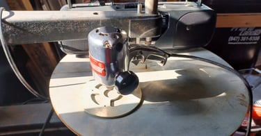
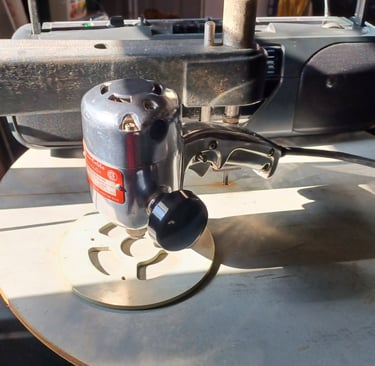
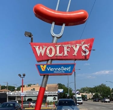
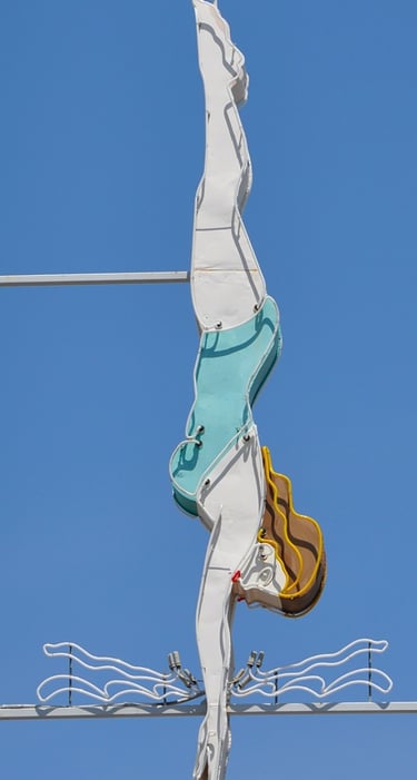
The Secret Sign Sauce
"The recipe we use to turn bright ideas into brighter signs"
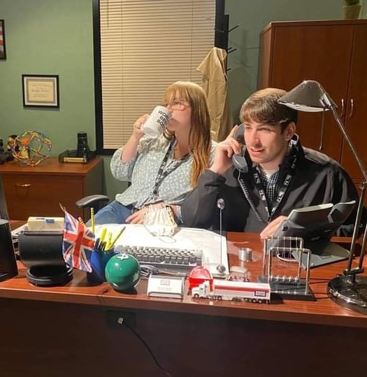
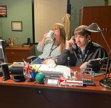

Our team
Our strength lies in our individuality. Set up by Greg, the team strives to bring in the best talent in various fields
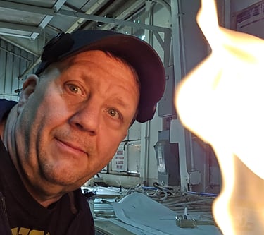
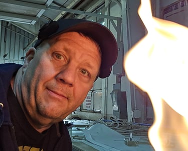
GREG


TRIXY


MAX
